LOOP LMS Feature Release Notes
At ACP, we are always working on new features and ideas to upgrade LOOP LMS to provide the best Learning Management System (LMS) experience on the market for you. We are excited to share with you what's coming to LOOP LMS in this release notes
September 2023
3.5.1.3
4th September 2023
Enhancements
1. Continuous effort to improve the Chinese language option of LOOP LMS
In addition to providing the users with the choice to select the site language in default English and Vietnamese, we have also been updating the terminologies across the site in Chinese. This will ensure continued accessibility for our end users who are more comfortable with the Chinese language.
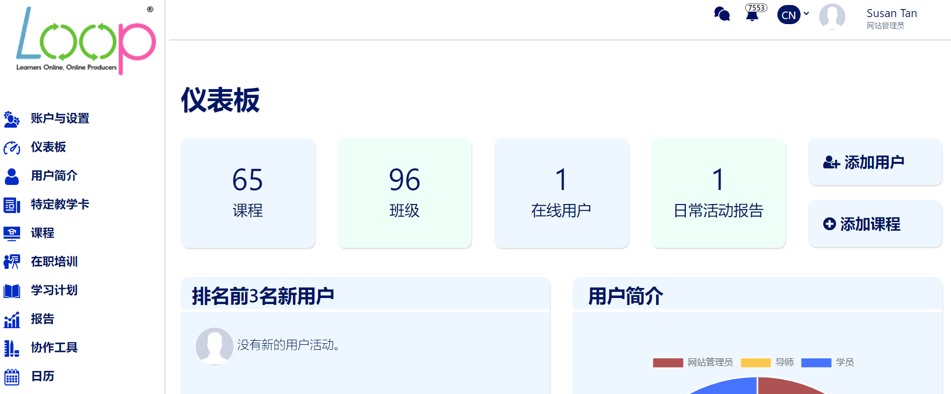
Fig 1.1 - On-going efforts to have the LMS to be available in Chinese
2. Updating the user interface for filters on Assessment
As part of our ongoing efforts to improve user experience, we've implemented enhancements to the user interface for filters on the Assessment listing page. We addressed the concern of overlapping elements and also made the listing page to be more mobile-friendly for all languages.

Fig 2.1 - Updating of Assessment listings’ filters UI
Bug Fixes
3. Fixes for filter function
During our routine sanity check of the LMS, we have discovered that some of the filters such as URL shown on the Audit Trial report will make the other pages to appear buggy when navigating to the other pages. We have addressed this and the end-users can now utilise the filter function seamlessly without any difficulties in accessing other vital sections of the platform.
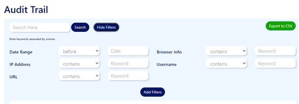
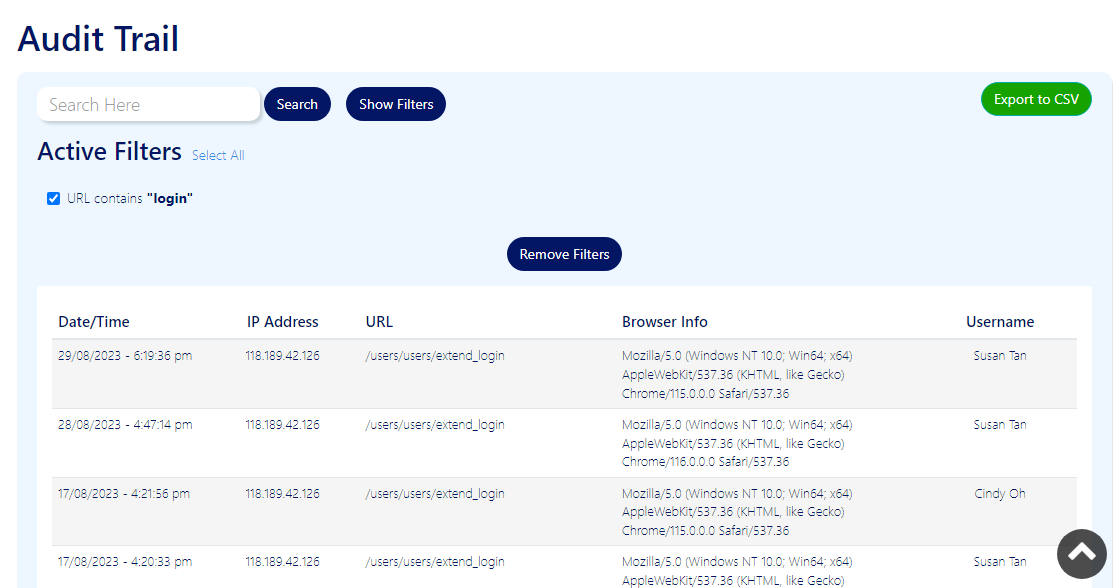
Fig 3.1 & 3.2 - Filter function for the Audit Trail and other listings has been fixed.
4. Fixes for previous page pagination
We have also fixed the issue where the end-user is unable to proceed to previous page when the listing pages display 1000 records and onwards. The fixes for the pagination, especially when there are more than 1000 records, will make the LMS to be user-friendlier for all.

Fig 4 - The previous page pagination has been fixed.
July 2023
3.5.1.2
25th July 2023
Bug Fixes and Enhancements
1. Enhancement for Navigation Menus
The new changes to the navigation menus are aimed at elevating user experience and ensuring improved accessibility. We have revamped the navigation menus, including the side bar and the top bar, to create a more seamless and user-friendly browsing experience for all our visitors. These changes have been carefully designed to make navigating through our website smoother and more enjoyable, allowing users to find the information they need with ease.
Side Bar: The side bar has undergone a transformation to offer a cleaner and more intuitive navigation experience. When navigating the site on Mobile browsers, the side menu opens up only when the ‘Menu’ button is clicked, which ensures that users can access the side menu precisely when they need it, providing a clutter-free and more focused browsing experience.
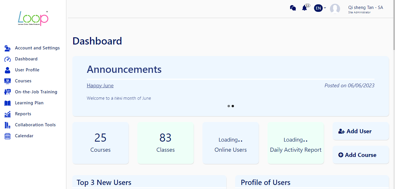
Figure 1 – Improved side menu
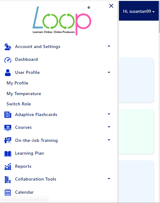
Figure 1.1 – Improved side menu for screens 767px and below
Top Bar: The top bar has been streamlined for better usability, especially on mobile devices. When navigating the site on Mobile and Desktop browsers, the top bar seamlessly transforms into a dropdown menu, ensuring a clutter-free view and enhanced accessibility. Language options are now within the dropdown menu, making it convenient for to switch languages without any fuss.
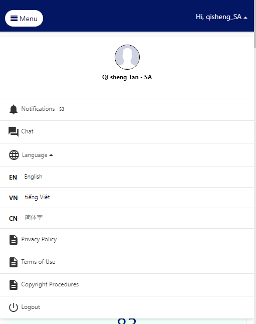
Figure 1.2 – Top Bar now displays ‘Hi _ (user’s username)’ which expands to a dropdown menu
2. Enhancement of Report Feature
We have made enhancements to the Reports feature in order to streamline its functionality and improve the overall user experience. Search and Reset buttons are now removed. This reduces the number of clicks for the users, but allowing accessibility at the same time.
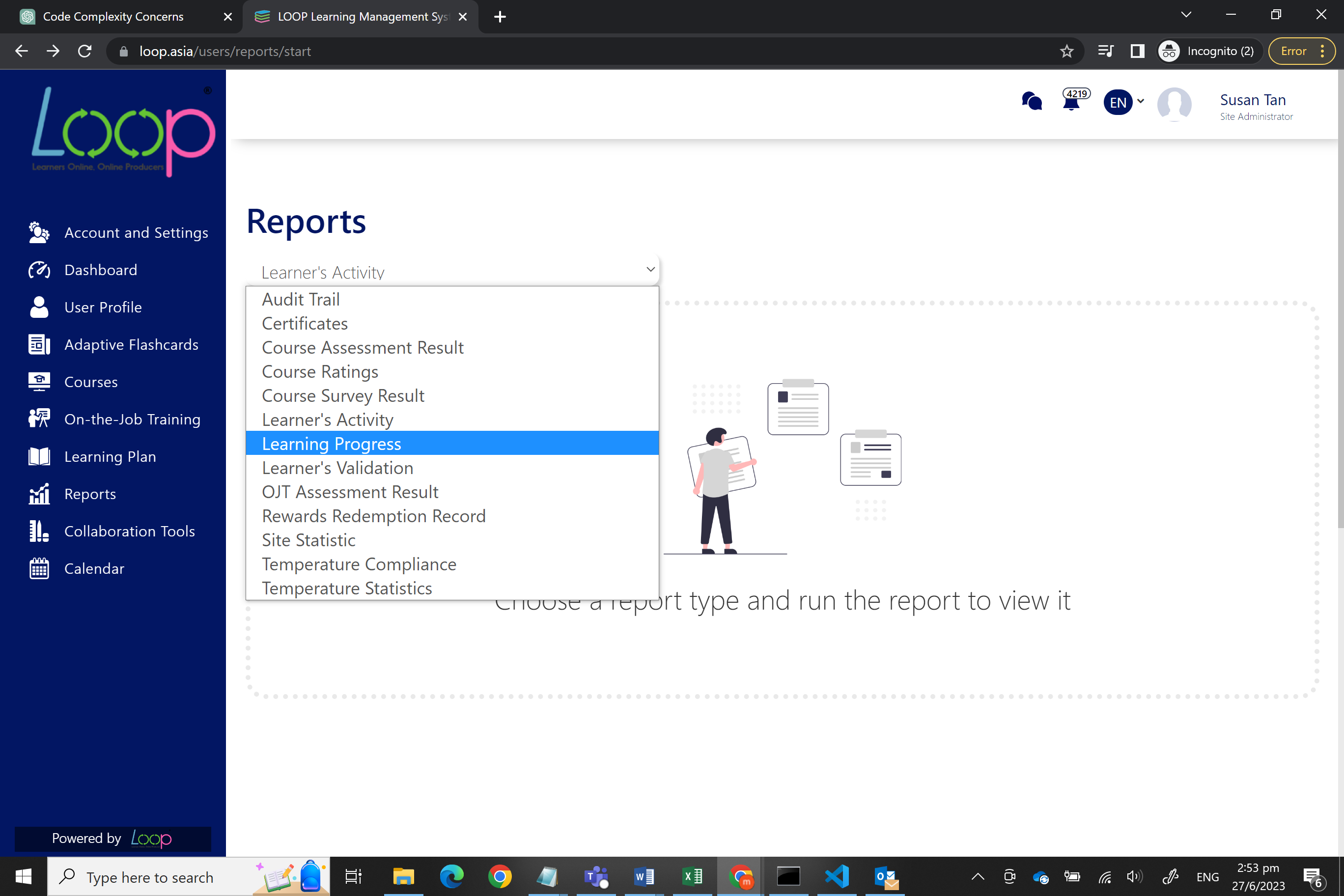
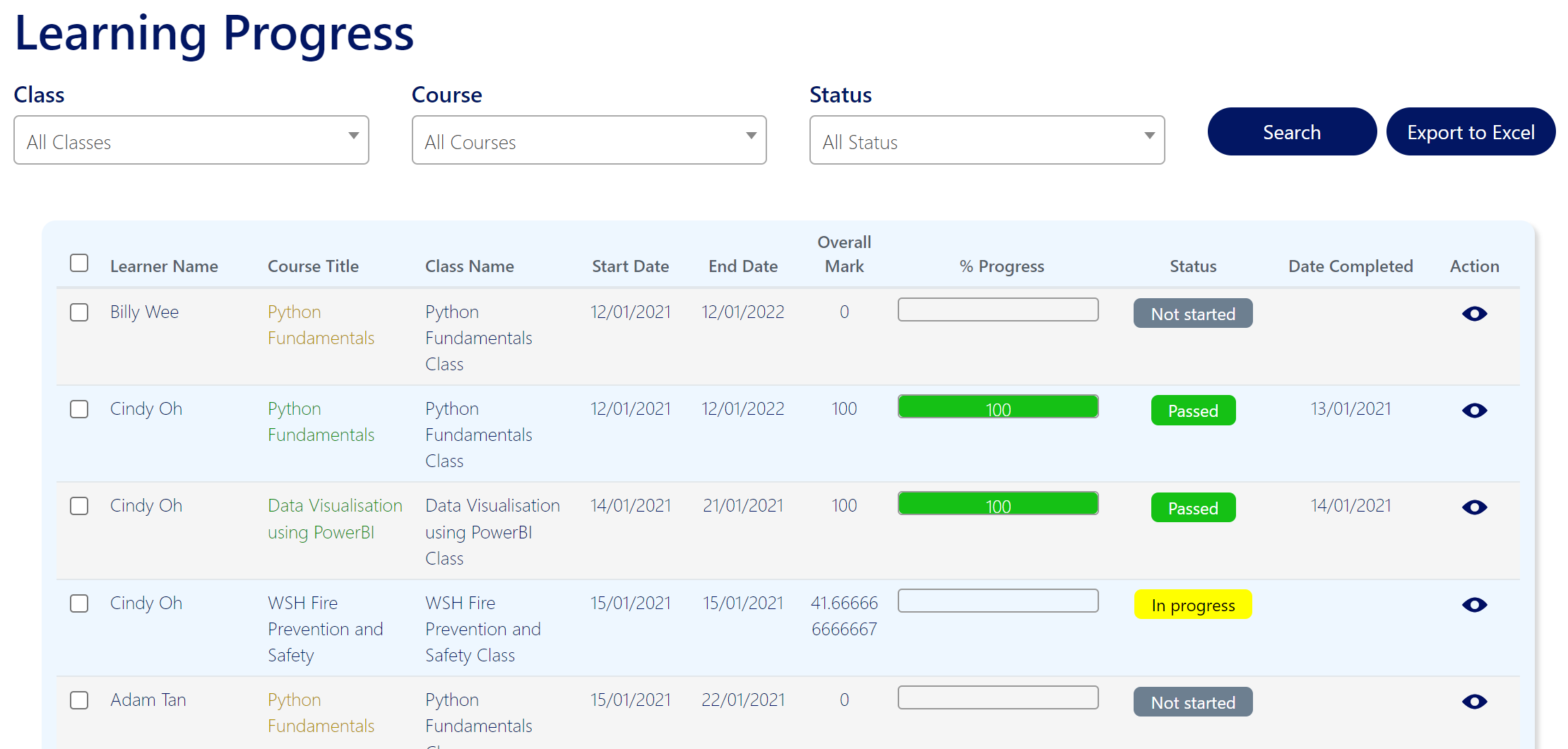
Figure 2.1 – Search and reset button has been removed. Once an option is clicked, user will be brought to their desired page
3. Fix for Learning Progress Report – Module Title
We have resolved the issue regarding the inaccurate display of module titles in the Learning Progress Report. Currently, the module title is displayed properly and as intended.
For files that have titles given to them during course creation, those titles will be displayed. If no title is provided,
1. For HTML files, the first few words of the content will be displayed followed by an ellipsis
2. For other files (e.g., Word, PDF, SCORM etc.), the name of the uploaded file will be displayed

Figure 3.1 – Module title is now being displayed based on the activity types
4. Fix for Completion of Course (Due Date)
We have rectified the error of the completion date of courses not being displayed accurately. Following the fix, upon successful completion or passing of a course, the "Due Date" field will now accurately reflect the status as 'Completed on DD/MM/YYYY'. This improvement ensures that the completion dates are properly recorded and displayed, providing users with clear and correct information regarding their course progress.
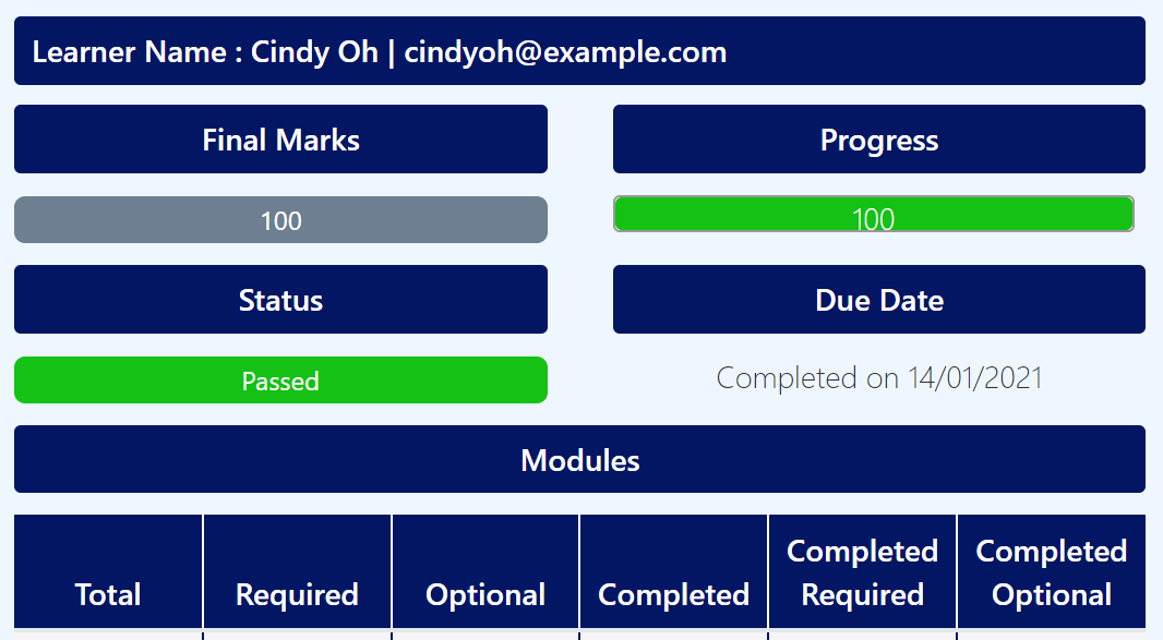
Figure 4.1 – 'Completed on DD/MM/YYYY’ is now shown under due date
June 2023
3.5.1.1
13th June 2023
Bug Fixes and Enhancements
1. Timely updates shown on Navigation Bar
We have rectified the error of the Navigation Bar not updating properly. During our sanity check, we discovered that when a user updates their First/Last name, the changes are not reflected on Navigation Bar timely. This has now been fixed and users are now able to see the changes instantly after updating their names.

Figure 1 – After updating First and Last Name, changes now reflected accordingly
2. Fix for Admin ‘Deactivate Selected’ Feature
We have resolved the issue where the Admin clicks the ‘Deactivate Selected’ button without selecting the users to deactivate, an error page is displayed. A prompt now appears when the Admin accidentally clicks the ‘Deactivate Selected’ button without selecting the users.

Figure 2.1 – Deactivate Selected button under ‘Accounts and Settings’

Figure 2.2 – After Deactivated Selected button is clicked

Figure 2.3 – Prompt message when ‘Deactivate Selected’ button is clicked with no users selected
3. Improved usability of Adaptive Flashcards filters
We have improved the usability of Adaptive Flashcard filters where only numbers are allowed for filter fields such as '# of Study Sets' and 'Total Learners'. If a character was inputted into these filter fields, a warning message appears, displaying ‘Please enter a number’.

Fig. 3.1 - When character is inputted in ‘# of Study Sets’
Additionally, checkboxes for filters will now be automatically checked when filtering. This allows greater convenience as the user do not have to manually check the filters themselves.

Fig 3.2 – Filters are automatically checked
4. Enhanced validation for Uploading New Resource
We have rectified the errors of Uploading New Resource when creating a course. During our sanity check, we discovered when the resource file is removed, the Admin is able to click ‘Save’ even though there are no resource file uploaded. This is later fixed in this release where if the user removes the uploaded file resource, and attempts to click ‘Save’, there are checks added to prevent users from doing so.

Figure 4.1 – Enabling checks for Resource file
5. Enhanced validation for uploading Unsupported Resources
We have enhanced validation for unsupported file types. Now when users add files that are unsupported by the system, they will receive a prompt stating ‘Unsupported file type’ to ensure greater clarify on what went wrong.
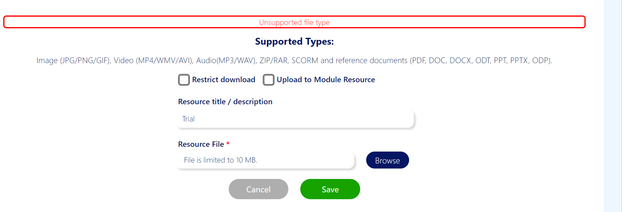
Figure 5 – Prompt for users for further clarity when unsupported file is submitted
6. Fix for ‘Course Objectives’
We have fixed the display of ‘Course Objectives’. When there are no content of ‘Course Objectives’ entered, the ‘Course Objectives’ heading will also not be shown.

Figure 6.1 – A course with no ‘Course Objectives’ entered

Figure 6.2 – A course with ‘Course Objectives’ entered
7. Tightening security for Users’ logins
We have tightened our security for the user’s logins. Users who fail to enter a valid password 3 times in a row will have to enter the security code based on the captcha values generated. ‘Invalid security code’ will be prompted if users failed to do so.
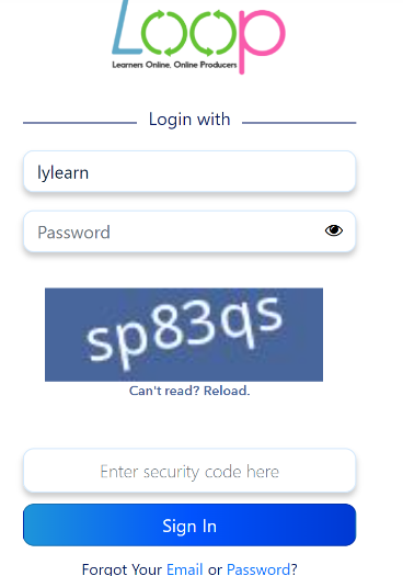
Figure 7 – Users have to fill in the security code to login
8. Enhancement for Audio files
We have also enhanced the display for Audio files. We have upgraded the UI of the audio player such that instead of the audio playing in a large window, it has been resized to be more compact and user-friendly.

Figure 8.1 – Window of Audio player is too big

Figure 8.2 – We have resized the audio player such that is more compatible for the UI
9. Enhancement - YouTube video title
We have made the YouTube title to be mandatory when adding a YouTube video to the course. This improves the user experience of the LMS as the learner is able to understand the context of the YouTube video by reading from the title of the YouTube video.

Figure 9 – Providing a meaningful title for the YouTube video
10. Enhancement - View Courses UI on Mobile
Lastly, we have also enhanced the View Courses UI on Mobile. The alignment and icons on the View Courses are now bigger to provide a better and meaningful experience to the end-user when viewing LOOP LMS on Mobile.
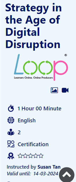
Figure 10 – Bigger and more meaningful icons on the View Courses page when accessing LOOP LMS on Mobile
3.5
6th June 2023
LOOP LMS
View Course Details Enhancements
To provide better experience to our admins, instructors and learners, we have improved the overall design of the View Course details page.
First, relevant icons are displayed next to the learning materials shown on the View Course details page. The intuitive icons aims to provide meaningful information to the learners.
They are also grouped into 3 categories using different colours:
• Turquoise to represent Media resources such as Images, Videos, Audio, PowerPoint and Word Documents.
• Brown to represent activities such as Assignment, Assignment and SCORM file
• Purple to represent Survey and Feedback forms

Learning materials - Media resources


Learning materials - Assessment, Assignment and SCORM file

Survey and Feedback forms

View Course detail page on Mobile Browser
Mobile-Friendly Timekeeper Function
We have also enhanced the mobile-friendliness of the timekeeper function. The timekeeper serves as an attendance tracking function where the users can time-in or time-out their attendance daily. For easier navigation, we have made the designs of the check-in and check-out buttons more prominent when accessing the LOOP LMS using mobile devices.


Timekeeper on LOOP LMS
Bug Fixes
• Display of SCORM title at View Course details page
• Fixed the bug where users not able to check in and check out their attendance
• Fixed the bug of the courses’ assignment progress not upgraded correctly after an assignment is uploaded
• Fixed the bug of Survey questions being added multiple times
LOOP Mobile Application
Login Enhancements
Before the enhancements, the users are not able to retrieve their username associated emails or reset their password and PIN on mobile.
The Reset password and PIN function is now upgraded:
1) You will now be able to retrieve your username associated emails.
2) You can recover your password and PIN on the mobile app.
3) Login functionality has been migrated to a more secure backend, ensuring our commitment to provide you with the topmost security when accessing LOOP mobile app.

User flow of resetting PIN and Password and retrieving email on LOOP Mobile app
Bug Fixes
Login
1) Fixed the bug where Biometrics was not logging the user in.
2) Fixed the bug where pressing the back button allowed the user to log in without entering or setting the PIN.
October 2022
3.4.1120
5th October 2022
Enhancement
Titles for Resources
Site Administrator and Instructors are now able to label their resources for the contents added under the new topics they have created. These titles will act as subtopic labels which allow for better organization of the resources under each new topic.

Just select what type of resource you would like to add to the topic with the " Add" button. You will be able to add resource titles for Text, YouTube URLs and New Resources. The course topics will be more organized with the subtopic labels.
Title for Text Resources
For text resources, the resource title field above the textbox.

Title for YouTube URL
For YouTube URLs, the resource title field will be above the YouTube URL field

Title for New Resources
For new resources, the resource title field will be above the upload section.

Instructors can organize multiple resources in under 1 topic and label them accordingly so that students can understand it better and pace themselves accordingly. This will facilitate microlearning more efficiently.
March 2022
3.4.793
31st March 2022
Enhancement
Managing Questions by Category
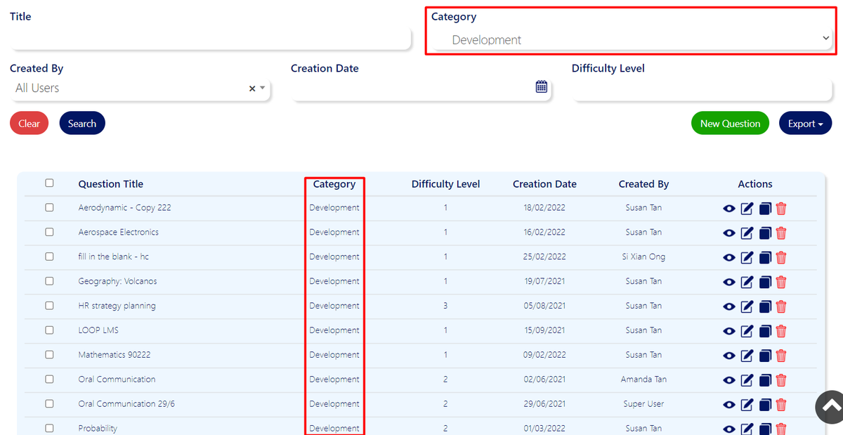
Site Administrator and Instructors are now able to tag categories to the questions in the question bank. There will be a new column in the listing to indicate which category the questions are being tagged to. An additional "Category" drop down menu will now allow site administrator and instructors to quickly filter the questions by category, easing the search process
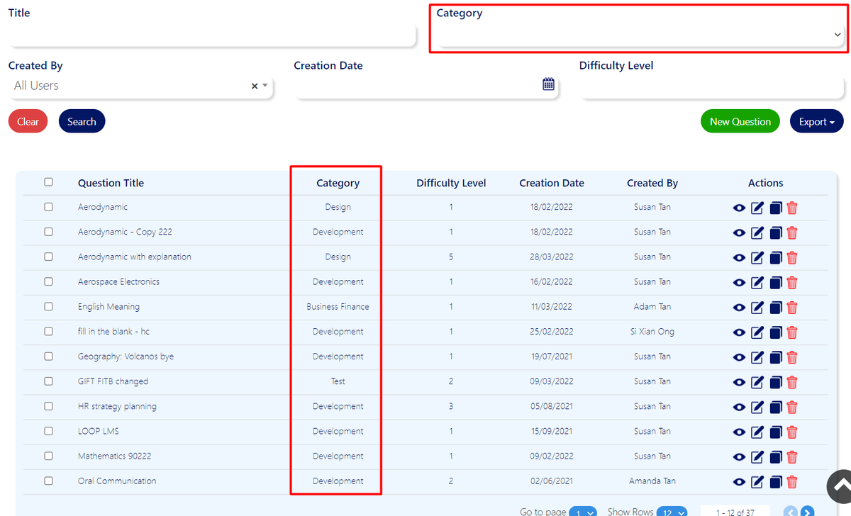
Just select a category from the drop down menu and click on the "Search" button. It will automatically filter all the questions that is being tagged to that category.
Privacy Settings
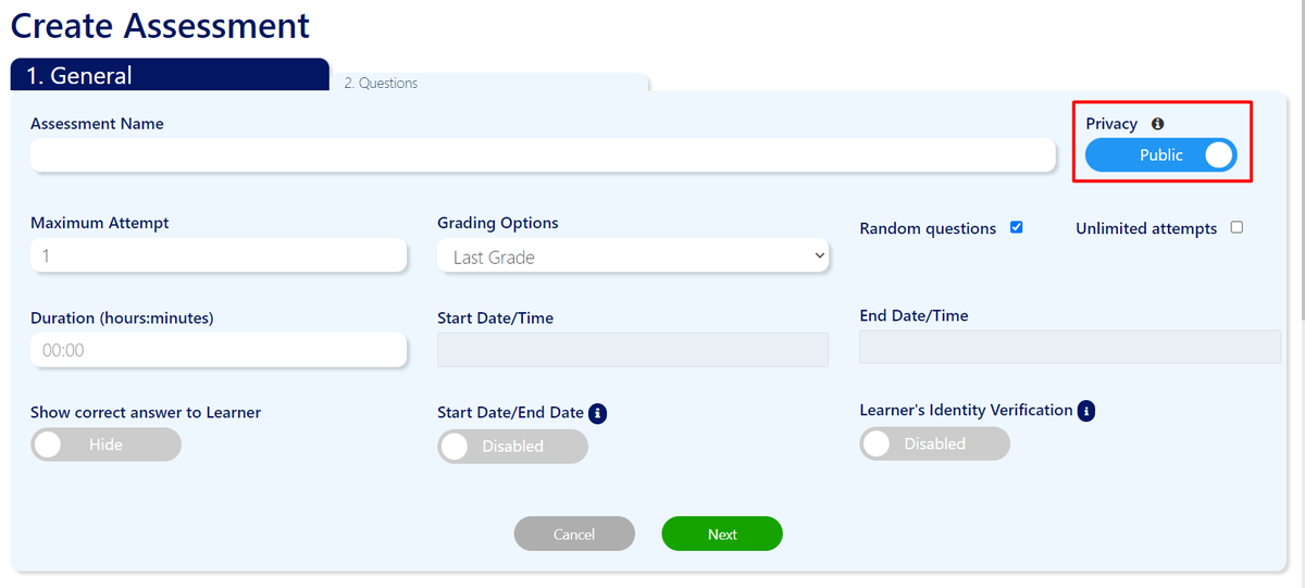
We have included an option to allow instructors to set the privacy settings of the questions or assessment they have created to private if they do not wish for others to view or edit it. This will ensure that no changes will be made to the questions or assessment by another user.
Instructors can change the privacy setting of the questions by adding a new question or editing an existing question. The privacy setting will be located at the top right hand corner of the form and will be able to toggle between "Private" and "Public".
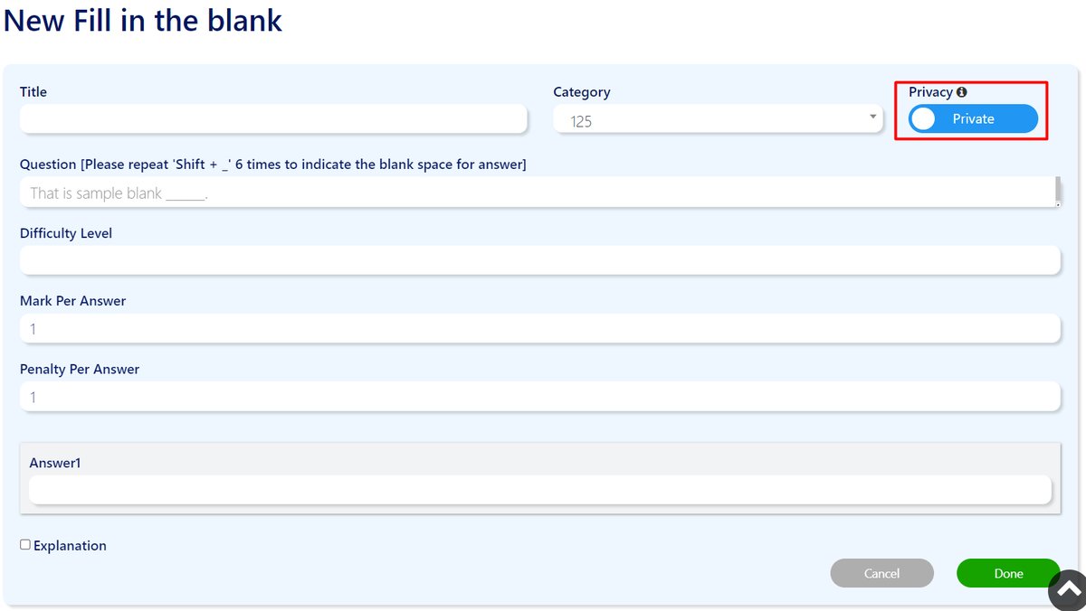 Similarly for creating new assessment or editing an assessment, instructors will be able to set the privacy of the assessment from the privacy toggle settings at the top right hand corner of the form under the general tab.
3.4.730
15th March 2022
Enhancement
Question Bank
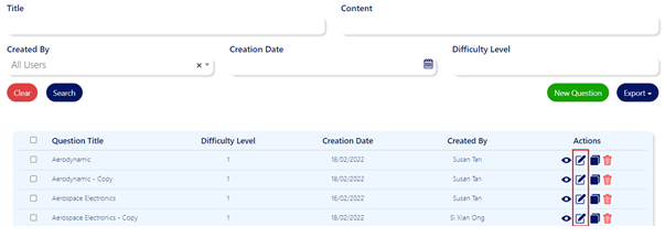
Site Administrator and Instructors are now able to make changes to existing questions by clicking on the “Edit” icon.
Site Administrators and Instructors are now able to duplicate existing question by clicking on the “Duplicate” icon.
The duplicated question will be saved as a new entry in the question bank for the user to edit further.
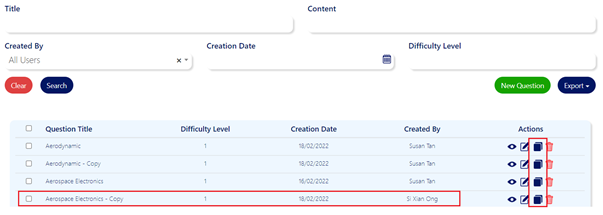 The addition of the Duplicate button in the Question Bank will help you better create a variety of questions with ease and contribute to the growing resources pool to enhance your learners’ experience.
Assessment
Site Administrators and Instructors are now able to edit the question in the assessment by clicking on the “Edit” Icon in the “Questions” Tab of the assessment.
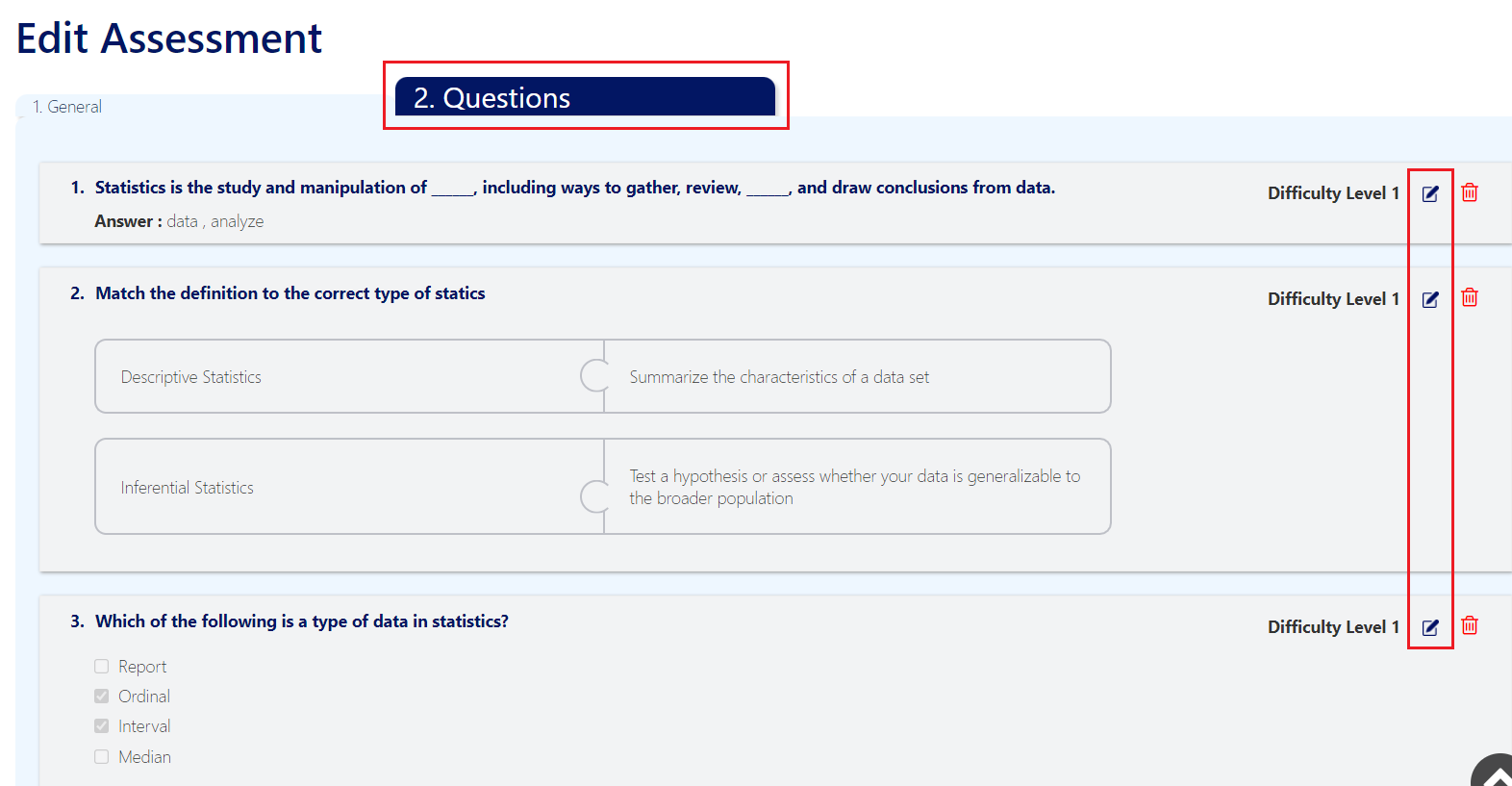
This improves the Assessment as a one-stop function for you to create and edit your course content.
UI Improvement
- Questions in assessment “Questions” tab are no longer interactive.
- Changes to the visual of the questions in assessment “Questions” tab
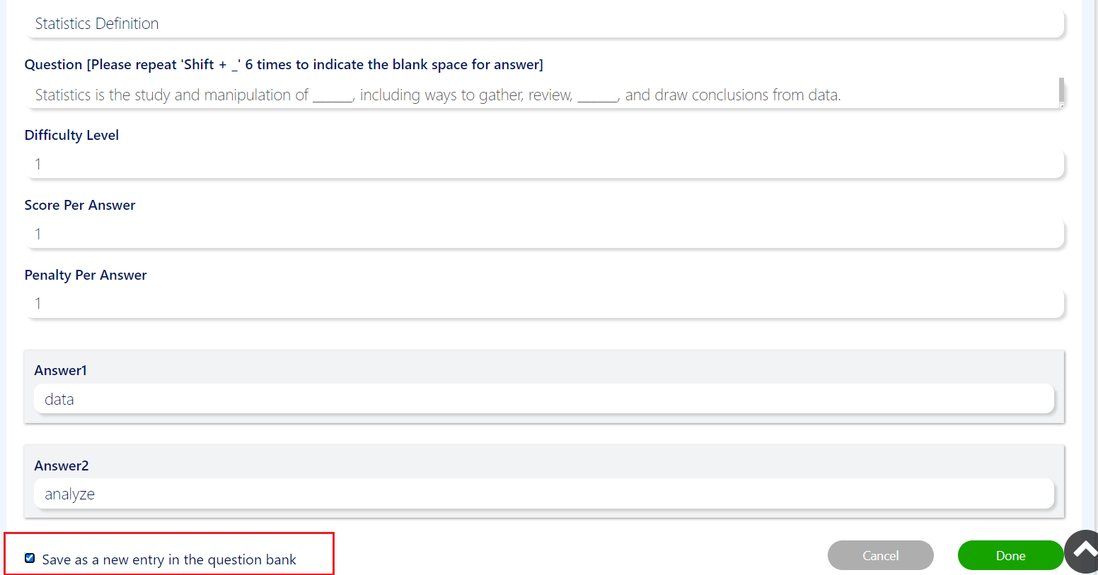
Site administrators and Instructors now have the option to save the edited questions in the assessment to the question bank by checking the “Save as a new entry in the question bank” checkbox.
This eases your workflow and gives you the option to save question directly into the question bank without having to navigate away from Assessment page. You will be able to see the saved question directly in the Question Bank after for your own use or to share with other users.
3.4.694
11th March 2022
We are now on Android and iOS!
LOOP LMS for Android and iOS is available for download from the Play Store and the App Store. Download yours now to access our LMS even through your mobile device!
New Features
Saving questions to question bank from assessment
Site administrators and Instructors now have the option to save the edited questions in the assessment to the question bank by checking the “Save as a new entry in the question bank” checkbox.
This eases your workflow and gives you the option to save question directly into the question bank without having to navigate away from Assessment page. You will be able to see the saved question directly in the Question Bank after for your own use or to share with other users.

Separate entity between question bank question and assessment question
For the site administrators and instructors, we want to ease your trouble of having to navigate between the Question bank and Assessment to edit your questions. Thus, with the new enhancements and features, we aim to better establish both the Question bank and Assessment in their function to serve you better.
With this change, you will be able to independently edit assessment questions from the Assessment page to better customize questions for your course learners. This improves the Assessment as a one-stop function for you to create your course material. Likewise, you will be able to independently edit questions in the Question Bank to contribute and propagate our shared Question Bank for your fellow users.


